
Review Online event 15 April: Mobile First
The best strategy for online success
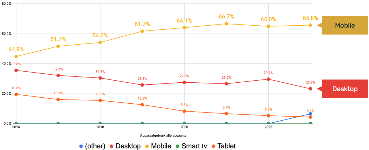
66% of visitors view your website on a mobile phone. A smaller screen and reduced attention span create unique challenges to captivate and engage your mobile visitor.
We give 6 tips on how to optimise your pages for small screens. Spoiler alert: Long pages are not a bad thing! Using the case of friesland.nl, we show what great results you can achieve with a mobile first design.
66% of visitors use a mobile phone
From the analysis of 230 websites of tourist destinations in the Netherlands, we see that 66% of visitors use a mobile phone. So it is very important to optimise your website for mobile visitors.
Tip:
Use the preview in plaece.creator to view the pages you are editing on your mobile too!
All content must be "above the fold"
The term "Above the fold" dates back to the days when newspapers were all over the newspaper rack and had to shout for attention to passers-by on the street. The newspaper with the most attractive headline on the front had the best chance of being bought.
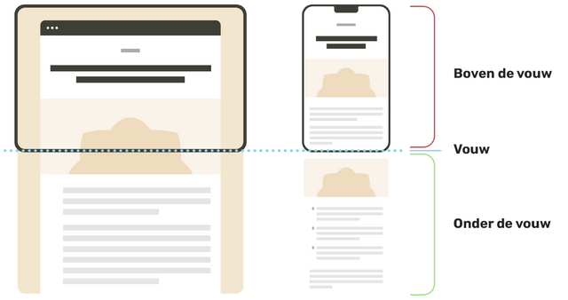
Of course, in the digital age, it is still very important that your most important message is immediately in view, especially on a mobile phone. But it is certainly not the case that you have to cram all the content you have "above the fold". People are used to scrolling, though. So don't be afraid that your pages will be too long. Long pages are not a bad thing, according to several studies:
- The focus is on ‘above the fold’, but people are used to scrolling (just think of Facebook, Instagram or TikTok)
source: https://www.nngroup.com/articles/scrolling-and-attention - 50 per cent of visitors scroll within 10 seconds (90 per cent within 14 seconds)
source: https://www.sectorlight.com/blog/scrolling-scrolling-scrolling - 66 per cent of attention is focused on content ‘below the fold’
source: http://uxmyths.com/post/654047943/myth-people-dont-scroll
6 tips for successful long pages
Tip 1: Easy navigation
Keep your menu ‘sticky’ and always visible
Add a ‘Back to top’ button

Tip 2: Structure content in a logical way
Build the page logically in terms of content and use clear distinctions between different topics.

Tip 3: Apply lazyload to images
Images are only loaded the moment they start appearing on screen. (That already happens by default on all your websites) Read also: Faster websites with lazy loading

Tip 4: Optimise images for mobile
Images are often used more 4-sided or vertical on mobile. Make sure your main subject is not out of focus.
-Set a focal point
-Use mobile video

Tip 5: Keep the content interesting
Vary the types of content
(tiles, text, video, other formats)
Ensure content is up to date

Tip 6: Don't make texts too long
Make sure no more than 50% of your screen is taken up by 1 piece of text. Above all, use headings and sub-headings. Make the page scannable.

How long can your texts be for a mobile phone?
Space on a mobile is limited, you don't want to write TOO long texts. Divide the text into short scannable paragraphs. For this, use the following guidelines:
Title: 6 words
Introduction paragraph: 20 words
Extended paragraph: 50 words
(obviously also depending on screen size and font size)
Case: friesland.nl - Impact of "mobile first" redesign for friesland.nl
Recently, the details page on friesland.nl underwent a redesign.
Objective:
- Better readable and usable on mobile
- Better integration of bookings
- Deliver more leads to entrepreneur
- Stimulate more interaction
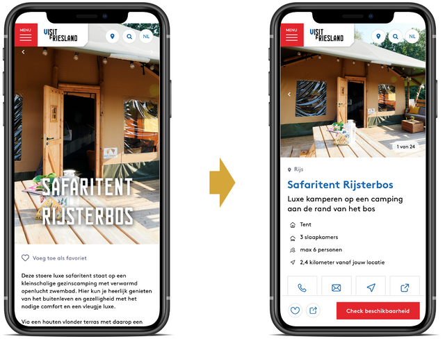
The page is completely redesigned, with the latest insights into mobile usage. For instance, the most important topics have been highlighted first and the page has been made scannable. Numerous innovative applications ensure an ultimate optimised page. And the results? They don't lie!
The results
1455%
more share actions
170%
more favourites
26%
More clicks on the CTA
Do you want this too?
Would you like to know more about the results? We are happy to tell you about them